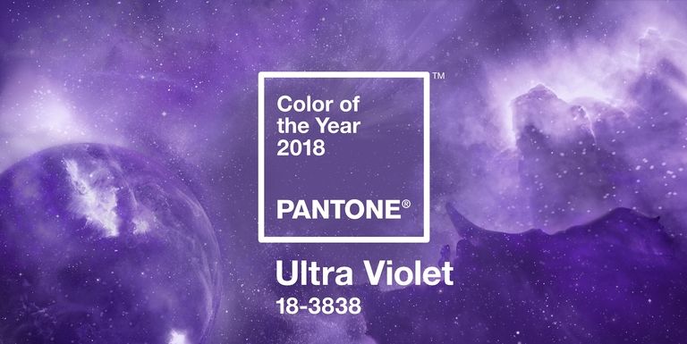
Not to toot our own horn, but we kind of saw this coming. Purple, or more specifically “Ultra Violet”, has officially been determined as the color of the year by Pantone. Every December the company names the hue of the upcoming year.
The color is selected as a representation of trends across a variety of design industries, including fashion and interior decorating. Overall, it’s “what’s needed in our world today,” the Pantone Color Institute’s vice president, Laurie Pressman said in a statement.
According to Pantone, the color of 2017 was “life-affirming” green (another integral hue at Smart Meetings). And in 2016, two shades—Rose Quartz and Serenity Blue—were selected to promote gender fluidity and celebrate their calming properties.
But what’s the significance of the plum shade? Pantone says that it’s a “dramatically provocative and thoughtful purple shade.” Additionally, it “communicates originality, ingenuity, and visionary thinking that points us towards the future.”
Let’s dig a little deeper. Pantone also cites that epic musicians such as Prince, Jimi Hendrix and David Bowie, embodied the hue. Not to mention, the color has historically signified royalty and luxury. Going a little further, some political statements might be indicated as well. “Suffragette purple” is one, as it was included in the National Women’s Party flag alongside white and gold. Additionally, we live in a country of divisive red and blue. The blended off-spring of these colors is purple—a refreshing neutral.
It’s established. Purple is an awesome color that’s well-deserving of its 2018 honor. So how can meeting and event planners make the most of Ultra Violet this upcoming year? We have a few ideas.
Pair it with Complimentary Hues
This can go a number of ways. Complementary colors are opposite positions on the color wheel. Another tactic using the wheel is the triad method. This involves pairing colors that are equidistant from each other on the color circle. For violet, this would be purple, green and orange—sound familiar?
You can also opt for something more muted. Light grey is a neutral tone that goes well with violet. Metallics always embolden purple too. These are just a few “rules” though. Experiment on your own and see what it yields. For instance, a variety of purple shades creates a very pleasing, and timely, look.
Capitalize on F&B Trends
Fortunately, this trend has been emerging for some time now so you’ll have options when adding this vibrant beauty to your palette.
In addition to violet macaroons, ice cream, frosting and other man-made products, there are some healthy options. For instance, grapes, purple potatoes, carrots and cauliflower, figs, cabbage, edible flowers, eggplant and many other natural foods boldly display the hue, minus the extra artificial sugar.
Select the Right Backdrop
If you’re set on purple, which if you’re not you will be soon, then consider making this a main consideration when scoping out venues. Beware of busy patterns or hues that might seriously clash (such as a bright red). Also be mindful of the season. If you’re planning for spring, big windows or outdoor space might be a huge plus as they’ll enhance the violet scheme.