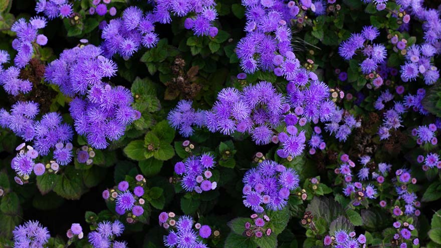
Meant to mirror the world in its hue, Pantone’s color of 2022 exits its isolation like morning light across the sky—the color of dawn; like the daylight-touched ocean waters as you rise to the surface through a blur of layers of blue; like forget-me-not petals in bloom. We, too, are emerging.
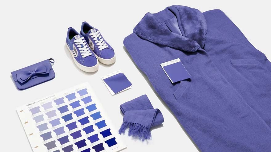
PANTONE 17-3938 Very Peri was announced as Pantone’s Color of the Year 2022 several days ago, after careful deliberation by Pantone Color Institute, the company’s business unit. The color is a new shade of periwinkle blue we haven’t seen before from Pantone—a fitting prelude to the promise of the new year after another full of unprecedented change.
“Trusted and Beloved Blue”: Why PANTONE 17-3938
The color comes as an eclectic mix of feeling with qualities of the bluest blues and its violet-red undertone. And this peaceful and grounded yet spirited duality of color is a timely representation of the state of our world, as well as what we wish it to be in the coming months—brimming with possibilities. Very Peri brings a dynamic tone to the global social conscious, intricately representative of the zeitgeist of the current moment, as Pantone puts it. Very Peri resembles the versatility and novelty of the digital, virtual and hybrid whereto we’ve stretched our previous limits.
Leatrice Eiseman, executive director of Pantone Color Institute, stated, “Very Peri illustrates the fusion of modern life and how color trends in the digital world are being manifested in the physical world and vice versa.”
It has been a year of even more new approaches, tactics and advancements in tech to meet the needs of a new world. Life just isn’t as it was—and it probably never will be. But that possibility should not instill dejection and reservation, according to Eiseman, but rather, it ought to inspire multitudinous potentialities for inquisitive curiosity and a strength that drives our collective continued betterment into the new year. New tech, textures and effects influence color and our relationship to it.
Very Periwinkle Events: How to Use the Color
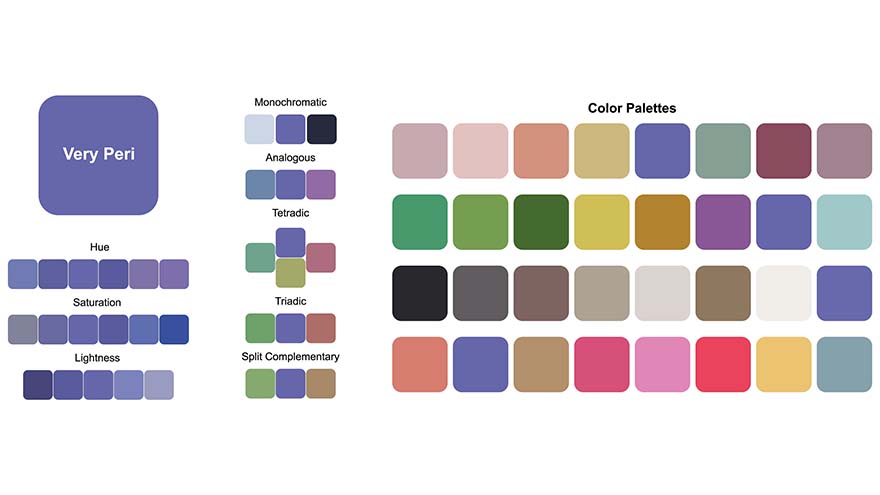
This year’s choice is an elegant shade that stabilizes palettes of nearly all moods and themes. Its both cool and warm undertones play well with others and give the color a transitional disposition. Pantone has delicately crafted several color combinations to help spark creativity when piecing together your own palettes for meetings and events. This year’s color opens the door to options, just as we’ve made the unparalleled, ironically rapid evolution as a global collective in the midst and wake of the pandemic, developing shared solutions across industries.
Where event planners may typically look to their own company colors when organizing and decorating an event, ask yourself how the new color of the year might fit right in with your own. Colors are not always permanent, says Kate Patay, CPCE, Smart Meetings’ Smart Style ambassador and the chief strategy officer of her own firm, Patay Consulting. The brand strategist and event consultant has observed that a shade typically has a lifecycle of around four years before it becomes intrusive and fades into the pop-cultural background for a while. Instead of living and dying by the color of the year, Patay recommends adding Very Peri as a pop of color to floral arrangements, lighting and stage design, for instance.
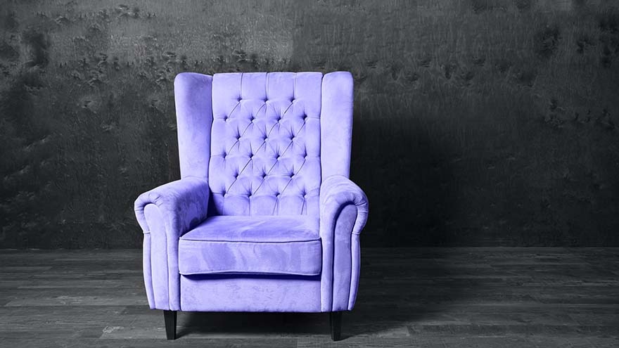
Very Peri could steal the show or act as a unifying shade that gracefully blends into those beside it. In and around centerpieces, for table linens and chairs, from monochrome backdrops to the finest accents—Very Peri is a powerful yet subtle addition to your 2022 color scheme, keeping events bright and sophisticated.