Refresh your events with purposeful design and messaging
 Two of the buzziest industry events showcasing forward-thinking ideas today are CES and SXSW. As producers of events across the world, we have a front-row seat on how brands are bringing their marketing strategies and purpose-driven initiatives to life and witnessed how these two are capturing hearts and minds of audiences, capitalizing on evolving trends and inventing new ways to connect.
Here are three design takeaways along with some spring trendspiration for the coming season.
The Human Touch
The human side of tech was front and center at CES. Consumer Technology Association (CTA) partnered with the World Academy of Art and Science (WAAs) and the United Nations to promote the Human Security for All (HS4A) pledge, centered on topics impacting the human experience such as access to healthcare, environmental protection and political freedom.
SXSW is known for progressive programming and this year even more tracks were added, including civic engagement and activism, health equity and sustainable food practices.
Cause-related marketing at events isn’t new. But instead of a side mention or demo to check a box, both events led with the universal theme of improving lives and bettering the world.
Read More: Making Meetings Green: Biophilic Design Uplifts Event Space
SCP Hotels at SXSW designed a tiny tropical paradise, SCP’s (Soul Community Planet) intentional space encouraged attendees to join the community, which prompted tree planting—a signature of its “holistic hospitality.” Sponsoring the “Conscious Voices” area where attendees enjoyed yoga, meditation and sound healing also promoted SCP’s mindful mission.
Trendspiration: It’s important to communicate purpose-driven initiatives, but also get strategic by telling your story from a broader perspective—how your offerings can make life better for your customer and/or the world. In addition to purposeful messaging, an effective way to humanize your space is including video and imagery of real people.
Eco Decor
Yesterday’s reception desk floral arrangements have evolved from add-on decor to intentional eco design that conveys purpose and philosophy. Sustainability made a design impact at both events with AstroTurf floor treatments and demo displays (a fitting contrast to hardware and tech), greenery, life-size “trees,” leafy accents woven into architecture, organic or simulated materials, and carpet swapped for smooth, recyclable flooring. Many spaces featured eco-forward messaging or activations touting green practices/products as well as earthy visuals.
Read More: Top 3 DMC Trends as Tracked by an AI Proposal Platform
At CES, global automaker Stellantis showcased its clean mobility message and a carbon net-zero commitment with “grass” flooring, minimalist architecture, natural visuals and framed walls of greenery—an artful contrast and balance to the electric cars on display.
Trendspiration: Instead of slapped-on ferns or florals, include sustainability in the design and planning from the start. A few ideas include creating a minimalist look (nix that carpet if you can) using natural, earthy materials and eco imagery. Be intentional with greenery—incorporate it into the design and structure no matter your footprint.
Calm, Cool and Collected
Both shows are all about stunning video and attention-grabbing spaces, but many designs and visuals took on a new tone that elevated the attendee experience while also calming down the noise. These design elements amplified visuals, provided a soothing balm to the cacophony and symbolized the intent to calm our constantly connected world.
Deep Reflection
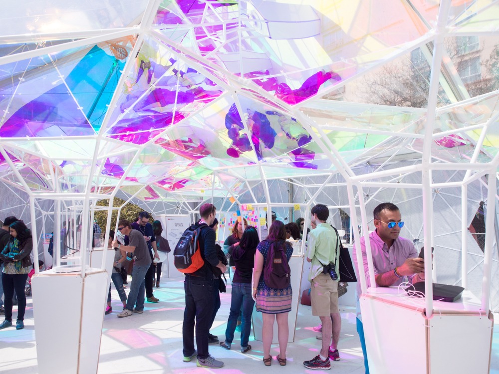
Reflective surfaces such as mirrors, water, high-gloss flooring and iridescent materials enhanced spaces, products and visuals. These elements respond to the environment by expanding space for a modern look.
At CES, LG introduced the first-of-its-kind wireless OLED TV. The 97-inch screen above a framed pool made it even more stunning. Water provided an outdoorsy feel that contrasted the monumental equipment.
Trendspiration: For a surprising spin, think mirrors—accents, backdrops, ceilings, even disco balls (we saw a huge one on the ground at the Slack Block Party and smaller ones in floral arrangements at La Croix. You can get similar effects with high-gloss flooring or materials that create dimension. Water is more involved, but that effort could add another opportunity for reflection—bringing the outside in.
Low Light Vibes
Spas use soft lighting strategically—it’s all about ambiance. Several brands took this cue with low-level lighting with soothing shades of blue, purple and green. Mysterious, shadowy spaces also countered notorious fluorescents and calmed the visual racket.
At SXSW, attendees entering Audible’s sound studio through a “speaker” door were transported inside the minimally lit “boombox” space to create the perfect inside-a-radio feel. Illumination varied throughout—halo spotlights for solo headphone experiences, low mood lighting for mingling, brighter for creation and neon inside mini recording booths.
Trendspiration: Accent lighting can transform a space, create a mood and showcase products whether you have a 100×100 or a 10×10 space. Experiment with dimness (think warm to soothe and cool to energize), angles and movement. Try on shades of blue or purple to evoke feelings of calm and green for an eco-tone.
Goodwill for All…Looks and Feels Good
Altruism made a visible impact on design at both events, which speaks to the importance of communicating values that resonate with today’s consumers who trust brands committed to addressing social issues.
It’s also a good point for event planners—by walking the talk, you set the tone for everyone to join in. And it’s a reminder for all brands: be intentional with planning and design. When you visually convey your purpose to better the world, the results look and feel good. And what better way to kick off spring?
—
Mickey Wilson is chief marketing officer with Freeman.


